Diving into character design can feel overwhelming at first, but with the right guidance, anyone can bring their imaginative figures to life. Whether you’re dreaming of creating quirky mascots or complex heroes, mastering the basics is the key to unlocking your creativity.
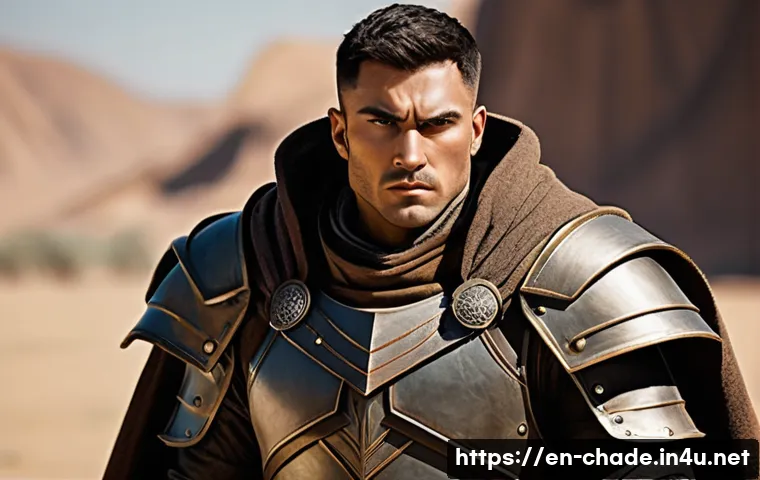
From understanding shapes and proportions to exploring personality through visuals, each step builds a stronger foundation. I’ve spent hours experimenting and learning, and the process truly transforms how you see art.
Ready to turn your sketches into memorable characters? Let’s explore the essentials in detail below!
Understanding the Power of Shape Language in Characters
How Basic Shapes Influence Personality
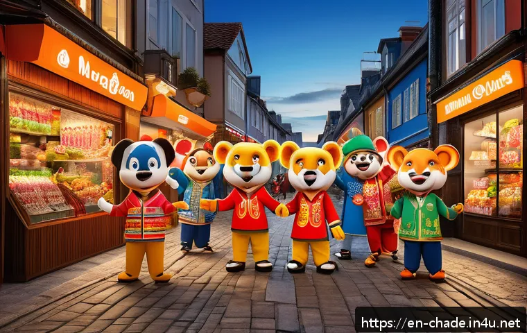
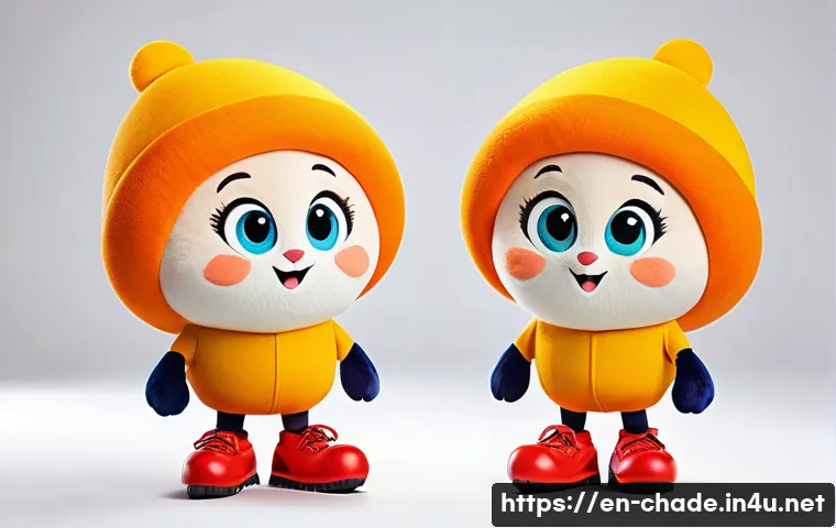
When you start sketching a character, the first thing to consider is the shape language. Circles tend to convey softness, friendliness, and approachability, which is why many mascot characters use them.
Squares, on the other hand, suggest stability, reliability, or stubbornness, giving a grounded feel to your design. Triangles introduce sharpness and energy, often associated with villains or dynamic heroes.
By consciously choosing these shapes, you can instantly communicate a character’s core traits without relying on details. Personally, when I switched from random doodles to deliberate shape use, my characters felt more intentional and memorable.
Combining Shapes for Unique Silhouettes
Silhouette is crucial because it’s the first thing people notice, even from afar. Mixing different shapes can create compelling contrasts—like pairing a round head with a triangular torso or adding square elements to a mostly circular figure.
This interplay helps your character stand out and makes them easier to recognize. A trick I learned is to sketch the silhouette first, then fill in the details.
This way, the overall design remains clear and strong. Also, don’t be afraid to exaggerate shapes; it can add a lot of personality and make your design pop in ways subtle realism can’t.
Shape Evolution Through Storytelling
As your character develops through different story arcs or emotional beats, their shapes can evolve too. A shy, round character might grow sharper edges as they become more confident or battle-hardened.
This visual evolution subtly reinforces their narrative journey. From my own experience, tweaking shapes over time keeps the design fresh and deepens the connection between the audience and the character.
It’s like their personality is literally shaping up on paper.
Mastering Proportions to Build Believability
Why Proportions Matter More Than You Think
Proportions are the backbone of any believable character. Even if you’re designing something fantastical, keeping consistent proportions helps the audience understand your character’s physical logic.
For example, larger heads often imply youth or cuteness, while elongated limbs can suggest elegance or agility. When I started ignoring proportion rules, my characters looked awkward or off-balance.
Once I learned simple guidelines—like the classic “head-to-body” ratio—it became much easier to create figures that felt natural, even in stylized worlds.
Using Reference and Grids for Precision
One method I swear by is using a grid system or simple reference points when sketching. This doesn’t mean your art has to be rigid or mechanical—it just provides a reliable framework.
For instance, marking where the shoulders, hips, and knees fall relative to the head can keep your character grounded. I’ve found that combining this with gesture drawing, which captures movement and flow, creates dynamic yet proportionate characters.
It’s all about balance between structure and freedom.
Playing with Exaggeration Without Losing Coherence
Exaggeration is a powerful tool in character design, but it can easily tip into weirdness if proportions get out of control. The key is to push features just enough to convey personality or emotion without confusing the viewer.
For example, stretching arms for a comedic effect or enlarging eyes to show innocence works well when done thoughtfully. I’ve experimented with this a lot, and the best results come from subtle exaggeration paired with solid underlying anatomy.
This keeps your character visually interesting and believable at the same time.
Expressing Personality Through Visual Details
Facial Features that Tell a Story
Facial design is where your character’s personality shines brightest. The shape and size of eyes, eyebrows, nose, and mouth all contribute unique emotional cues.
For example, wide eyes with raised eyebrows can make a character appear curious or innocent, while narrow eyes and a smirk may hint at slyness or mischief.
When I design, I spend extra time on facial expressions because they’re what viewers connect with emotionally. Small tweaks here can change the entire vibe of your character, so don’t rush this step.
Costume and Accessories as Extensions of Character
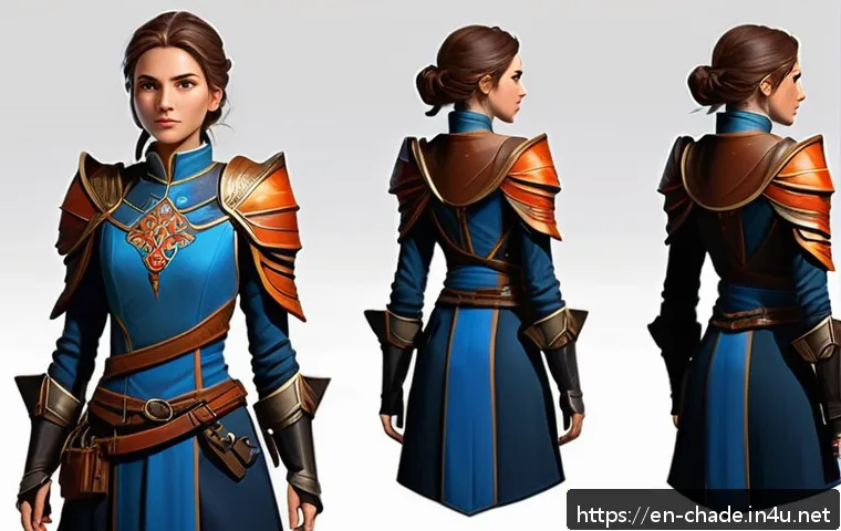
Clothing and accessories aren’t just decorative—they’re storytelling tools. A character’s outfit can reveal their background, profession, or even mood.
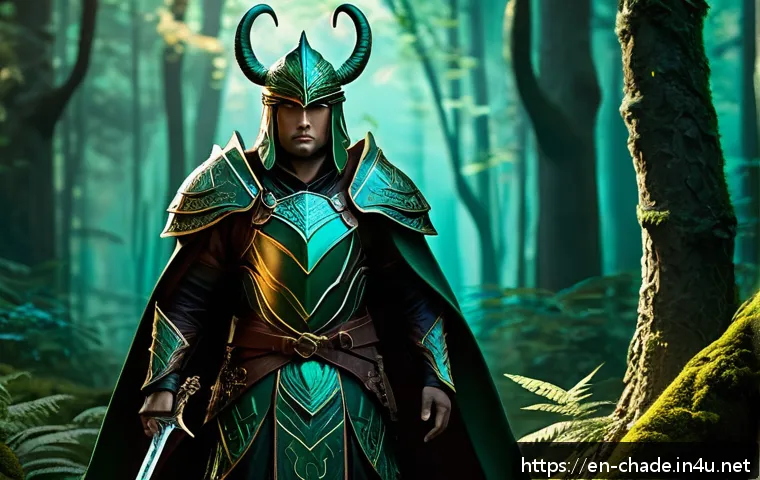
A worn leather jacket might suggest a rebellious past, while intricate armor could indicate a warrior’s discipline. I remember designing a character with mismatched boots and a patched cloak to hint at a nomadic lifestyle, and that detail sparked conversations and theories among my audience.
So, think about how every piece of clothing or gear adds layers to your character’s identity.
Color Choices That Reinforce Traits
Colors carry psychological weight and can dramatically influence how a character is perceived. Warm colors like red and orange often evoke energy and passion, while cool blues and greens suggest calmness or mystery.
When I experiment with palettes, I try to match colors with personality traits or story roles. For example, a villain might wear dark, muted tones to feel ominous, whereas a hero might sport bright, contrasting hues to stand out.
Don’t underestimate the power of color harmony and contrast—it can make or break your character’s visual impact.
Building Dynamic Poses to Bring Characters Alive
Capturing Movement and Emotion
Static characters can feel lifeless, so mastering dynamic poses is essential. When I first started, my figures looked stiff and boring, but learning gesture drawing changed everything.
The goal is to capture the flow and energy of a pose, not just anatomical accuracy. Even a subtle lean or tilt can suggest mood—like confidence, hesitation, or aggression.
I often imagine my character in action or interacting with their environment to find natural, expressive poses that tell a story beyond the face.
Using Line of Action for Fluidity
Line of action is a simple yet powerful concept that guides the overall movement of a pose. It’s an imaginary curve that runs through the figure, creating rhythm and balance.
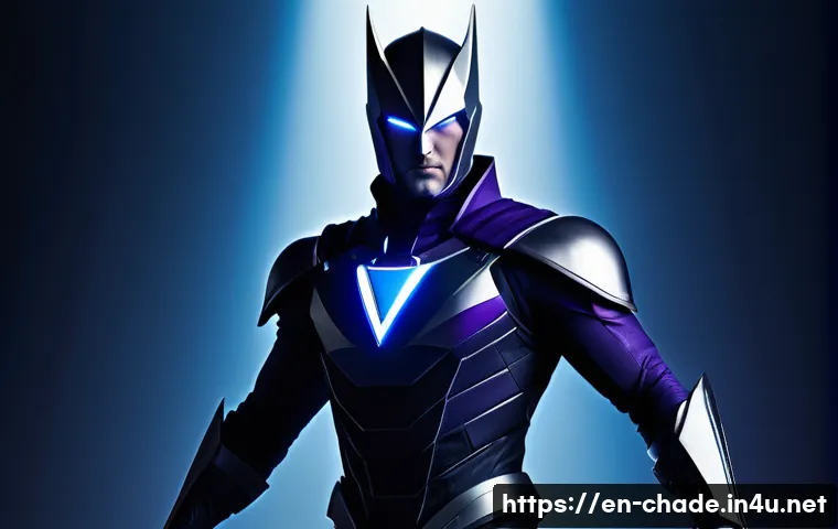
When I apply this technique, my characters instantly feel more lively and less rigid. It’s especially useful for exaggerated or cartoon styles where fluidity is key.
Practicing line of action sketches daily has become a personal habit that keeps my designs fresh and energetic.
Balancing Anatomy with Style
While dynamic poses rely on good anatomy, stylization allows for creative freedom. The trick is to know enough anatomy to avoid awkward or impossible positions, then bend the rules to fit your character’s unique look.
For example, a superhero might have exaggerated muscles and exaggerated motion lines, while a whimsical mascot could have oversized hands or feet to emphasize gestures.
This balance between realism and exaggeration keeps your design believable yet visually captivating.
Creating Backstories to Deepen Character Appeal
Why Story Matters in Design
A character’s backstory isn’t just for writers; it directly informs visual choices. Knowing where your character comes from, what motivates them, or their struggles helps you design with purpose.
For example, scars, worn clothing, or specific color schemes can reflect their history or personality. I’ve found that even a simple backstory makes sketching more engaging and results in richer designs.
It’s like you’re drawing a living, breathing person rather than just a figure on paper.
Incorporating Personality Flaws and Strengths Visually
Characters become memorable when they have contradictions—strengths paired with flaws. Visually, you can show this through asymmetry or contrasting elements.
For instance, a tough warrior might have a gentle expression or delicate accessory that hints at vulnerability. I once designed a gruff character with a small, cherished flower pin, which sparked curiosity and empathy from viewers.
These details add depth and make your character relatable and unique.
Developing Characters Through Iterative Design
Character design is rarely perfect on the first try. I encourage multiple drafts and evolving ideas as you learn more about your character’s story and personality.
Sometimes, changing a hairstyle or adjusting proportions after writing a new backstory can reveal fresh directions. Iteration keeps the creative process alive and often leads to surprising, satisfying results.
Don’t be afraid to revisit and refine—your best character might be just one redraw away.
Effective Use of Color and Lighting in Character Presentation
Choosing Colors That Complement Character Mood
Color isn’t just decoration; it’s a mood-setter. For example, muted earth tones can ground a character in a realistic setting, while neon or pastel colors might give a futuristic or playful vibe.
In my own projects, I’ve experimented with color shifts to reflect emotional states—darker shades for sadness, brighter ones for joy. This technique subtly influences how viewers feel about your character before they even speak or move.
Lighting to Enhance Form and Drama
Lighting adds depth and dimension, turning flat sketches into vivid, three-dimensional designs. Directional lighting can emphasize muscles, facial features, or textures, while softer lighting creates a gentler, approachable feel.
When I apply dramatic lighting in my character renders, the personality feels amplified—like a mysterious figure lurking in shadows or a heroic silhouette glowing in sunlight.
Playing with light sources also helps define the mood and setting without extra details.
Color Palettes and Their Psychological Impact
Different palettes evoke distinct reactions, and understanding this can boost your character’s appeal. For example, complementary colors (like blue and orange) create vibrant contrasts that catch the eye, while analogous palettes (colors next to each other on the wheel) offer harmony and calmness.
I often map out several palettes and test them on my character before settling on one. This experimentation is crucial because the wrong palette can dilute your character’s intended vibe.
| Aspect | Effect | Example |
|---|---|---|
| Shape Language | Communicates personality instantly | Round shapes for friendly mascots |
| Proportions | Builds believability and style | Large heads for cute characters |
| Facial Features | Expresses emotion and character | Wide eyes for innocence |
| Costume | Reveals background and traits | Worn jacket for rebel look |
| Pose | Conveys energy and mood | Leaning stance for confidence |
| Backstory | Informs visual storytelling | Scars reflecting past battles |
| Color | Sets mood and psychological tone | Warm reds for passion |
| Lighting | Enhances drama and depth | Strong side light for mystery |
Conclusion
Understanding the nuances of shape language, proportions, and visual details truly elevates character design. When these elements are thoughtfully combined, they bring characters to life in a way that resonates deeply with audiences. Through practice and attention to storytelling, your designs become more than images—they become memorable personalities. Keep experimenting and refining, and watch your characters grow beyond the page.
Useful Information to Keep in Mind
1. Shapes are the foundation of character personality—use circles, squares, and triangles deliberately to convey traits instantly.
2. Maintaining proper proportions creates believability, even in stylized or fantastical designs.
3. Facial features and expressions are key to emotional connection, so invest time in refining them.
4. Color and lighting dramatically influence mood and perception, enhancing storytelling without words.
5. Dynamic poses and backstories add depth, making characters feel alive and relatable.
Key Takeaways
To design compelling characters, start with clear shape language to communicate personality at a glance. Balance anatomy and style by mastering proportions and using exaggeration thoughtfully. Enhance emotional impact through expressive facial features and meaningful costume details. Use color and lighting intentionally to set tone and highlight character traits. Finally, support your visual design with a well-developed backstory and dynamic poses to create characters that truly engage and linger in the audience’s mind.
Frequently Asked Questions (FAQ) 📖
Q: What are the fundamental shapes I should focus on when starting character design?
A: When beginning character design, it’s super helpful to start with basic shapes like circles, squares, and triangles. These shapes form the building blocks of your character’s silhouette and personality.
For example, round shapes often convey softness and friendliness, while sharp angles can suggest edginess or aggression. In my experience, sketching with simple shapes first keeps the design process flexible and allows you to experiment with proportions before adding details.
This approach really helped me avoid getting stuck on complex features too early.
Q: How can I effectively express a character’s personality through their visual design?
A: Expressing personality visually is all about combining elements like posture, facial expressions, clothing, and color choices. For instance, a confident hero might have an upright stance, bold colors like red or blue, and a determined expression.
On the other hand, a quirky mascot could have exaggerated features, playful colors, and a relaxed pose. I found that thinking about how the character moves and reacts in different situations adds layers to their personality.
It’s like telling a story through every visual cue, making your character feel alive and relatable.
Q: How important are proportions in character design, and can I break the rules?
A: Proportions are crucial because they help establish the character’s style and believability. That said, character design is flexible—rules are more like guidelines.
For example, exaggerated proportions can create a unique, memorable look, like oversized heads for cuteness or elongated limbs for elegance. When I started, sticking to basic human proportions helped me understand anatomy better, but once comfortable, playing with proportions opened up so much creative freedom.
The key is balancing what feels right for your character’s story and personality while keeping it visually appealing.